Headline Styles
Stylish modern lighting options
The right light can transform any environment
Thoughtfully curated modern lighting fixtures
The right light can transform any environment
8 Genius Ways to Use Lighting in Your Home
How To Choose The Right Lighting For Any Room
Text Styles
Right Lighting For Any Room
Text Styles - Combos
There are 7 types of text classes for working with typography. To easily align all your typography in the sections every text class comes with a combo class clearing the margins coming from the main class. As you can see on the example below there is Bottom Clear which removes the Bottom Margin, Full Clear for setting both margins to 0 and Top Clear is great for aligning headlines to the same level as paragraphs.
etc…
Colors
Paragraphs
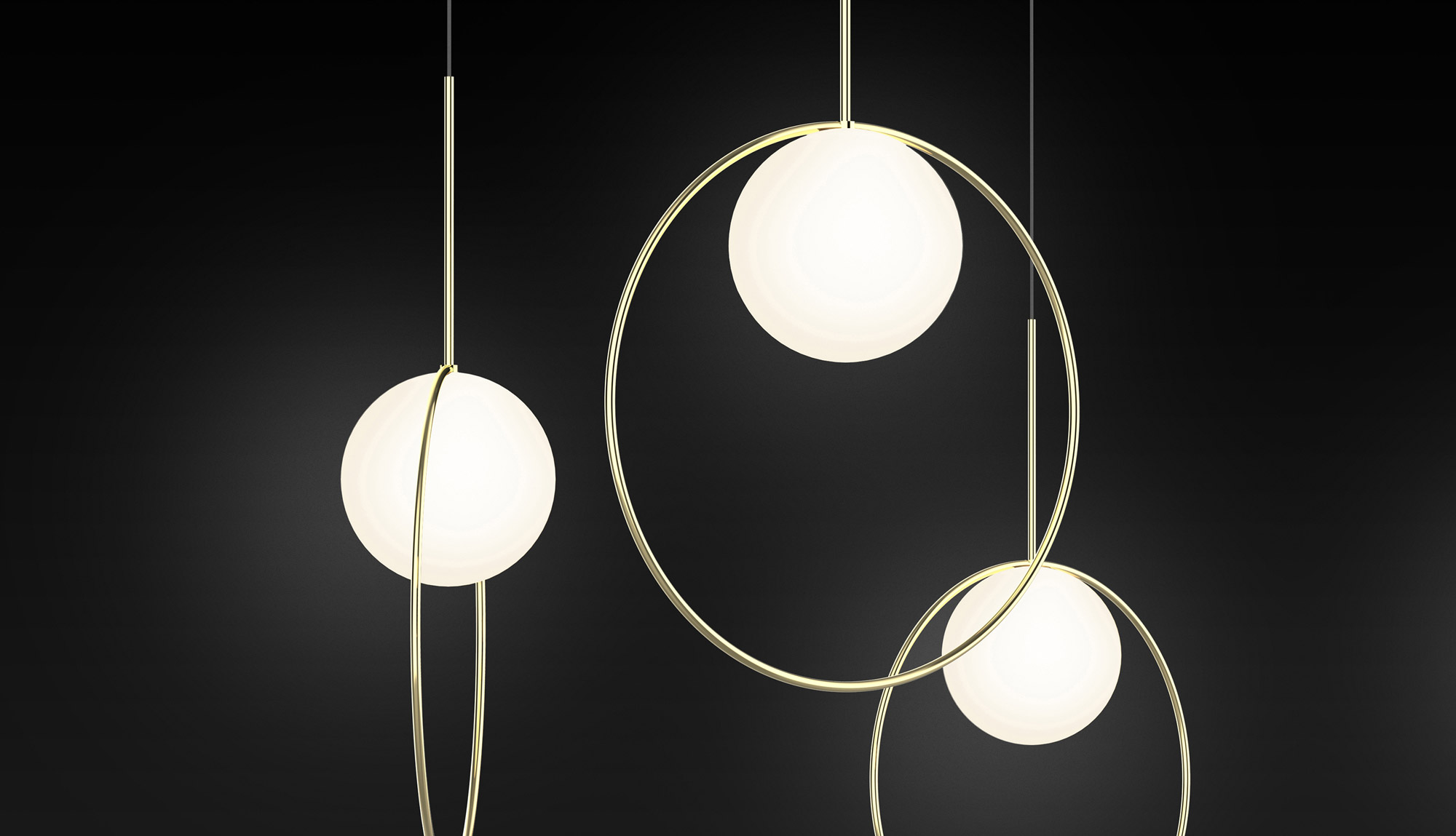
With the creation of his first product in 1993, Pablo established a powerful and generative design philosophy. Since then, his core principles have informed the development of every light in the studio’s 25-year history. These products continue to move with culture while withstanding trends in design — and each one carries the underlying uniqueness that is distinctly “Pablo.”
With the creation of his first product in 1993, Pablo established a powerful and generative design philosophy. Since then, his core principles have informed the development of every light in the studio’s 25-year history. These products continue to move with culture while withstanding trends in design — and each one carries the underlying uniqueness that is distinctly “Pablo.”
With the creation of his first product in 1993, Pablo established a powerful and generative design philosophy. Since then, his core principles have informed the development of every light in the studio’s 25-year history. These products continue to move with culture while withstanding trends in design — and each one carries the underlying uniqueness that is distinctly “Pablo.”
As we know now, there are 7 types of text classes for working with you typography. To easily align all your typography in the sections every text class comes with a combo class clearing the margins coming from the main class. As you can see on the example below there is Bottom Clear which removes the Bottom Margin, Full Clear for setting both margins to 0 and Top Clear is great for aligning headlines to the same level as paragraphs.
As we know now, there are 7 types of text classes for working with you typography. To easily align all your typography in the sections every text class comes with a combo class clearing the margins coming from the main class. As you can see on the example below there is Bottom Clear which removes the Bottom Margin, Full Clear for setting both margins to 0 and Top Clear is great for aligning headlines to the same level as paragraphs.
With the creation of his first product in 1993, Pablo established a powerful and generative design philosophy. Since then, his core principles have informed the development of every light in the studio’s 25-year history. These products continue to move with culture while withstanding trends in design — and each one carries the underlying uniqueness that is distinctly “Pablo.”Default LinkLink Style 1Link Style 3
- How to customize formatting for each rich text
- How to customize formatting for each rich text
- How to customize formatting for each rich text
- How to customize formatting for each rich text
- How to customize formatting for each rich text
- How to customize formatting for each rich text
Sure. Your paid subscription can be cancelled anytime by shifting to Lite plan.
Sure. Your paid subscription can be cancelled anytime by shifting to Lite plan.
Rich Text
Heading 1
What’s a Rich Text element?
The rich text element allows you to create and format headings, paragraphs, blockquotes, images, and video all in one place instead of having to add and format them individually. Just double-click and easily create content.
Static and dynamic content editing
A rich text element can be used with static or dynamic content. For static content, just drop it into any page and begin editing. For dynamic content, add a rich text field to any collection and then connect a rich text element to that field in the settings panel. Voila!
How to customize formatting for each rich text
Headings, paragraphs, blockquotes, figures, images, and figure captions can all be styled after a class is added to the rich text element using the "When inside of" nested selector system.
Heading 5
Heading 6
- List Item
- List Items
- List Item
- Link Item
Bold
Italic
Headings, paragraphs, blockquotes, figures, images, and figure captions can all be styled after a class is added to the rich text element using the "When inside of" nested selector system.
Labels

Forms
Product Cards
Product Cards are the main building part of every store. So to give you maximum flexibility Product grid cards are coming with S, M, L, XL combo classes. This is particulary handy when filling your CMS with landscape or portrait pictures. Don't forget that you can always go with different number of columns. Recommended number of columns is 1 to 4 for the optimal experience.
Wrappers
Wrapper is the ultimate building element to be able to put together all the UI Kit sections together. It's not required way how to combine the parts together but it definitely helps and makes your life easier. The way to use Wrapper element is to drag and drop Div Block into the canvas give it Class "Wrapper" and then use combo class (another class) from the dropdown menu with the exact spacing you would like to see. This makes your life easier and again it won't require any additional visual coding or polishing from your side. Currently there are margins of 0, 20, 50, 80, 100.